WeChat: (+86)13978873330 Email: 381784025@qq.com

WeChat: (+86)13978873330 Email: 381784025@qq.com

In recent years I have seen a good number of new columbaria whose first impression on entering is "impressive": a double-height atrium, a looped circulation route, gold-clad columns, and an LED screen scrolling the park's promotional film.
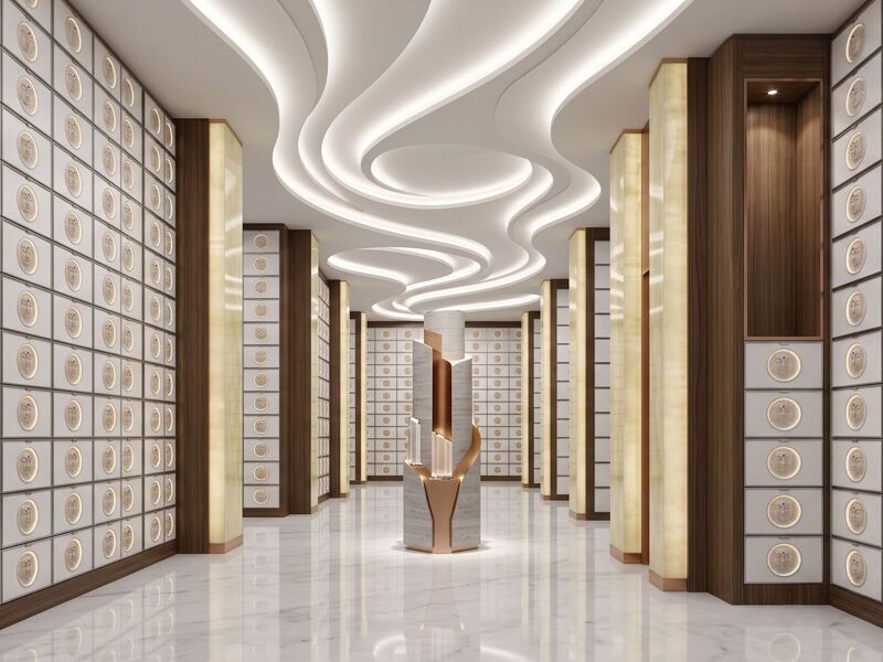
There is nothing wrong with impressive. The problem is that this vocabulary comes from shopping malls. A mall is designed to make people walk a few more steps, stay a little longer, pass a few more shopfronts. A memorial space has the opposite objective: help people find the place quickly, stay quietly, and leave with dignity. The two objectives use two different spatial grammars. Mix them and you get a very strange feeling: clearly expensive but you cannot bear to stand in it.
Mall circulation is a carefully designed detour: atrium distribution, offset escalators, curved primary routes — all of it to lengthen the path. Commercially that logic is correct, because every extra step is another chance to buy.
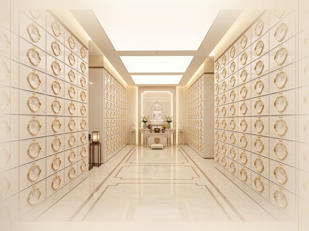
A columbarium hall cannot work that way. Families come with a specific destination: this column, this tier. The circulation should make that route as short and as straight as possible. Ideally, you can see the zone you need from the entrance.
A testable standard: no more than 35 m walking distance from the entrance to the furthest niche, and clear indication of several zones visible from the entrance. Fail those two and the circulation was drawn for browsing, not for arriving.
Mall illuminance is generally above 500 lux, with plenty of dynamic light sources, because brightness excites people and makes them willing to stay and spend.
A columbarium hall should sit between 150 and 250 lux, and should be mostly static. This is not about creating solemnity; it is functional. Light that is too bright makes the lettering on door panels harder to read, and light that moves drags the eye away so that people cannot settle.
A more specific point: if the niche door panel is a glossy material, high illuminance produces strong reflection, and a person standing at the niche sees their own reflection. This is completely invisible in photographs. You only understand how awkward it is when you are standing there.
A mall changes its installations and visual merchandising every season, because novelty is its product.
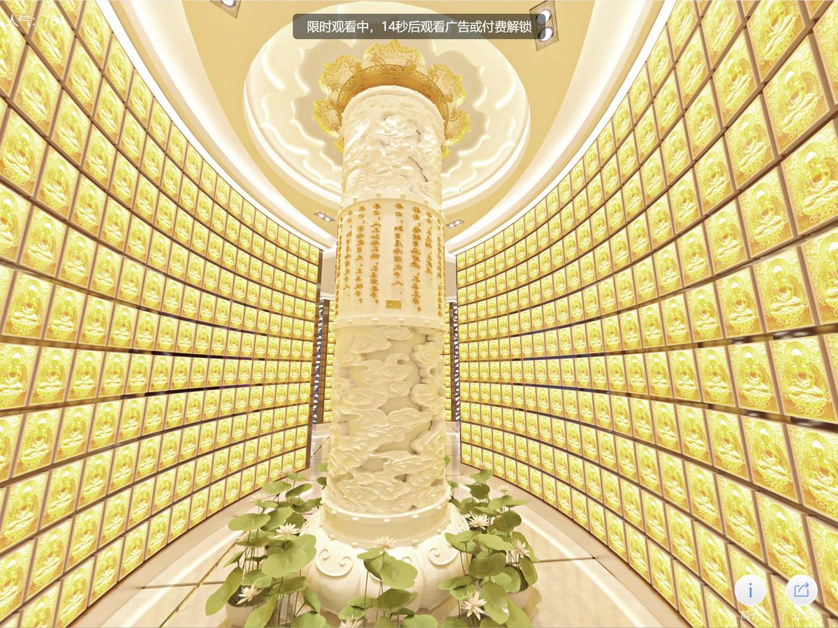
A columbarium is the reverse. What it fears most is looking old in three years. Gold-clad columns oxidise and darken. Polished stone scratches. LED screens lose brightness and drift in colour after three years — and that screen is hanging in the most conspicuous position in the building.
My view: in a columbarium hall, any investment made "so it looks good on opening day" should be discounted by half before you consider it. A columbarium hall is a thirty-year object. The test for whether an approach should be used is "will it still hold up in year five", not "will it look good on opening day".
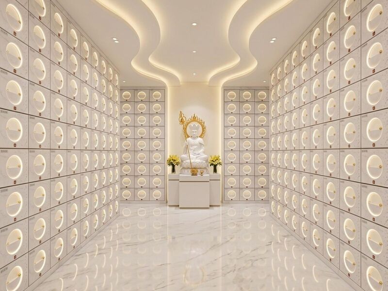
Three reasons, all of them practical.
First, sales needs. A columbarium has to sell niches, and sales needs a scene that "looks worth the price". Double height, gold and a big screen become the default answer.
Second, developer background. Many people building columbaria come over from commercial real estate or hotels, and the spatial vocabulary in their hands is the mall vocabulary.
Third, lack of references. There are few mature domestic examples to visit, and most of what can be seen is commercial columbaria in Taiwan and Japan — and what gets copied is the surface.
First, listen. Walk in and say one sentence. Listen for reverberation. In a mall atrium the echo is masked by background music; a columbarium has no background music, and the echo exposes immediately that the volume is too large.
Second, look for reflections. Stand in front of a niche and see whether your own shadow appears on the door panel. If it does, the relationship between material and light has not been resolved.
Third, count the places to pause. Walking from the entrance to the furthest niche, how many places are there where you could sit down or pause? A mall does not need them — it wants you moving. A columbarium must have them, because half the people who come are over sixty.
Q: Without an atrium, is there no sense of grandeur?
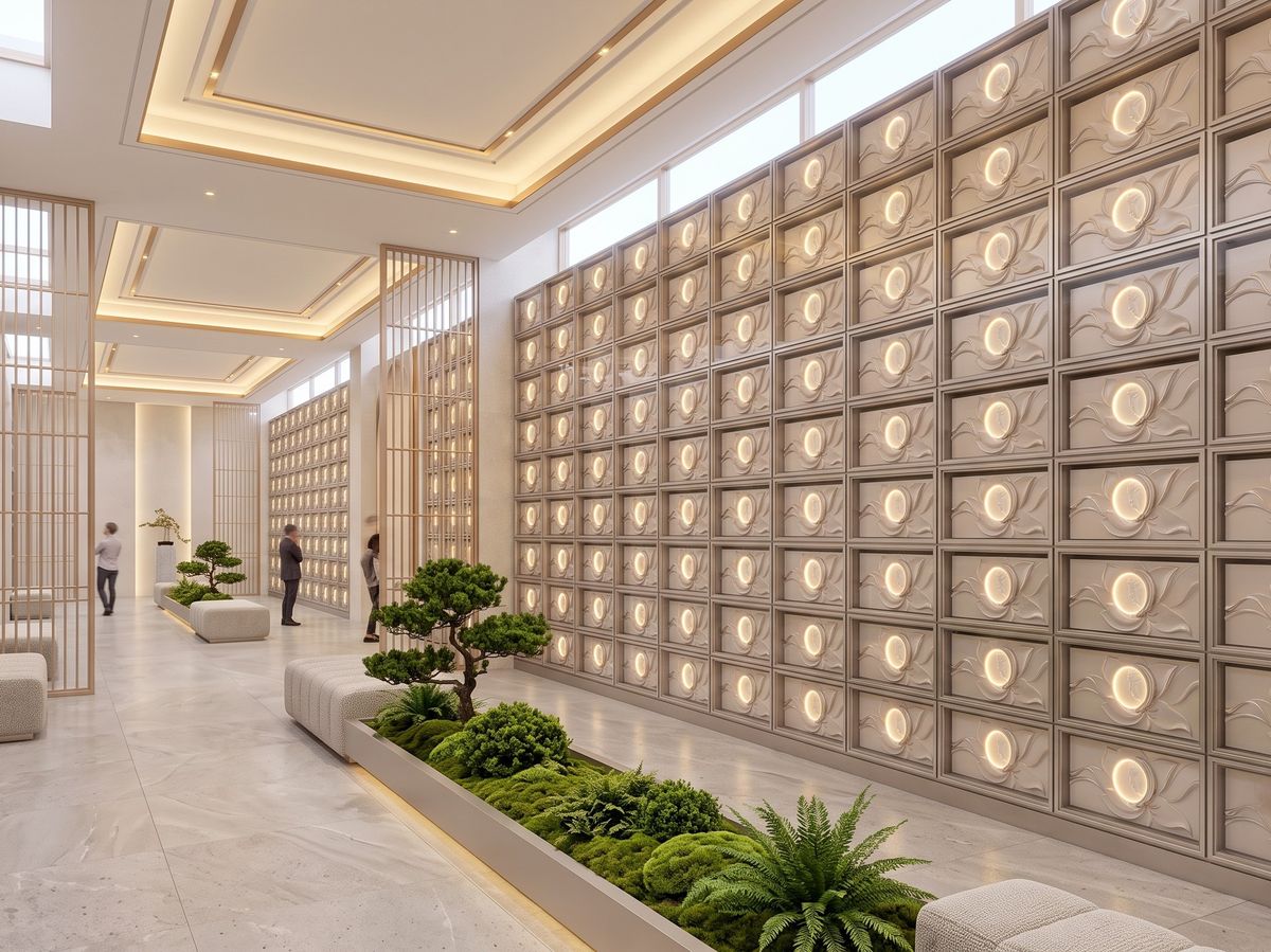
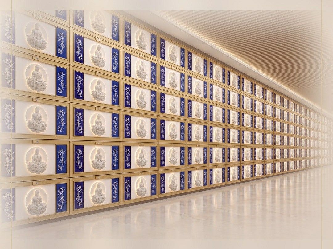
Grandeur is not the same as a void. The grandeur of a columbarium hall can come from the continuity of the array: several hundred niches running in order across a whole wall. That sense of order has more power than an atrium.
Q: It has already been built in mall style. Can it be saved?
Save the light first. Change dynamic sources to static, bring illuminance down to around 200 lux, and redirect spotlights from the walls onto the niches. None of the three requires structural change, and together they change seventy per cent of the impression.
Q: Should the big screen stay?
Keep the position, not the content. The only two things a columbarium screen should show are the wayfinding directory and the day's memorial notices. Playing a promotional film is the equivalent of running advertisements in a funeral hall.
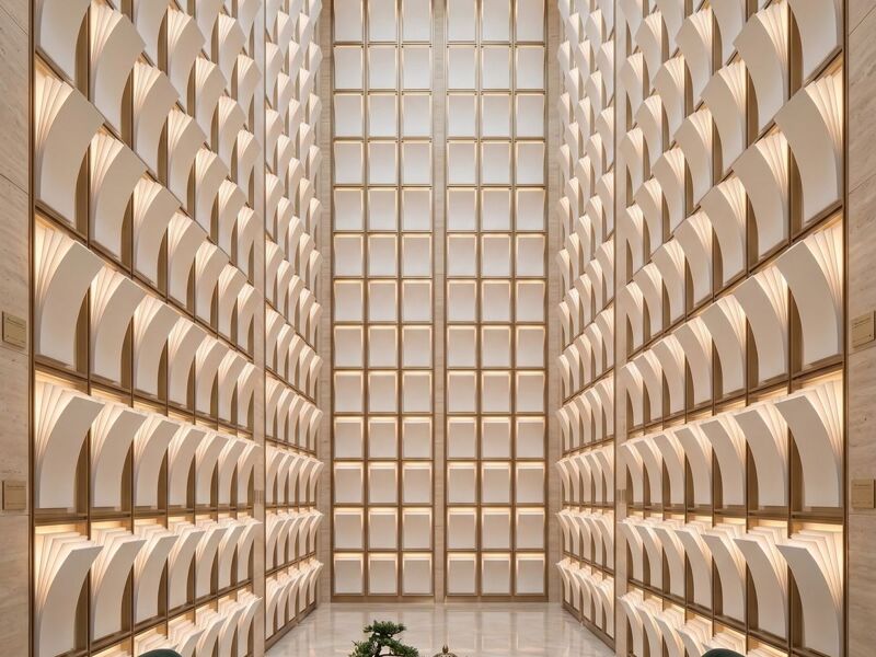
The space of a columbarium is for arriving, not for browsing. The reason the mall vocabulary works so well is that it serves dwell time. What is needed here is dwell quality. One word apart, an entire approach apart. The simplest way to judge whether a columbarium hall is well made: walk in, and ask yourself whether you are willing to stand there two minutes longer.